Skydance Branding Reveal

I am beyond excited for the post, but mostly I’m so excited to reveal the final branding for this amazing business!
Skydance Acupuncture is a small luxury business for stress relief, balance and anti-aging. Skydance Acupuncture specializes in cosmetic acupuncture and stress relief for professional adults. After getting trained in Meizen and using acupuncture personally for balance, ache and pain relief and stress relief, Aletha wanted to start her own small business helping others find the same relief.
I feel so grateful to have worked on this project and to have been able to take some amazing ideas and bring them together to create something that she will use for her business. Thank you so much Aletha, for letting me see your passion for your practice in acupuncture and helping others, and for allowing me to go on this journey with you! I can’t wait to see what you do in the future!
Skydance Acupuncture’s goal is to “Reduce signs of aging, while balancing the body and increasing energy”.
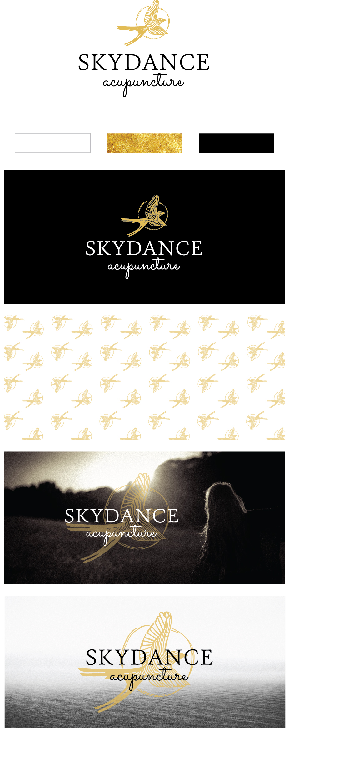
After brainstorming, creating a moodboard, and testing out a few different avenues, we both were sold on having a sleek text logo that played into the luxury and minimal feel, but we needed to figure out one major thing. The number one concern was that a lot of people are scared of needles, so we wanted to minimize that by introducing a graphic that is more natural and comforting.
The name “Skydance” was inspired by the scissortail flycatcher in flight and how it looks like it dances at it flies. So this was an element that I thought would be important to included in the logo. Acupuncture focuses on the different natural points and currents within the body, so I created a drawing of a scissortail, with lines following the movement of it’s body as the main icon and graphic.
To stick with the timeless, luxury and minimal feel that Aletha wanted, we decided to go with three main colors: white, black and gold.
Here is the final brand we landed on: